Now that we have gotten some of the "required" house improvements complete (new roof, new furnace, landscape re-graded, and popcorn ceiling removal) we are now getting around to some more cosmetic fixes.
 One of the big improvements is the entryway light. The existing one was a brass, 90's, builder grade fixture. None of those adjectives are a good thing. I was so excited to get it out of the house that I forgot to take a picture, so here is one from two years ago when we had the ceilings de-popcorned.
When looking for a new fixture there were a couple things I was looking for.
- We need a tall fixture, as the entryway is somewhere around 25-30 feet tall, but not very wide.
- We are slowly changing all the metals to a brushed nickle finish instead of a shiny brass.
- The house is more of a transitional style (between traditional and modern,) so something a little contemporary but not too modern.
- I'm not a fan of exposed light bulbs, so some sort of glass shade is preferred.
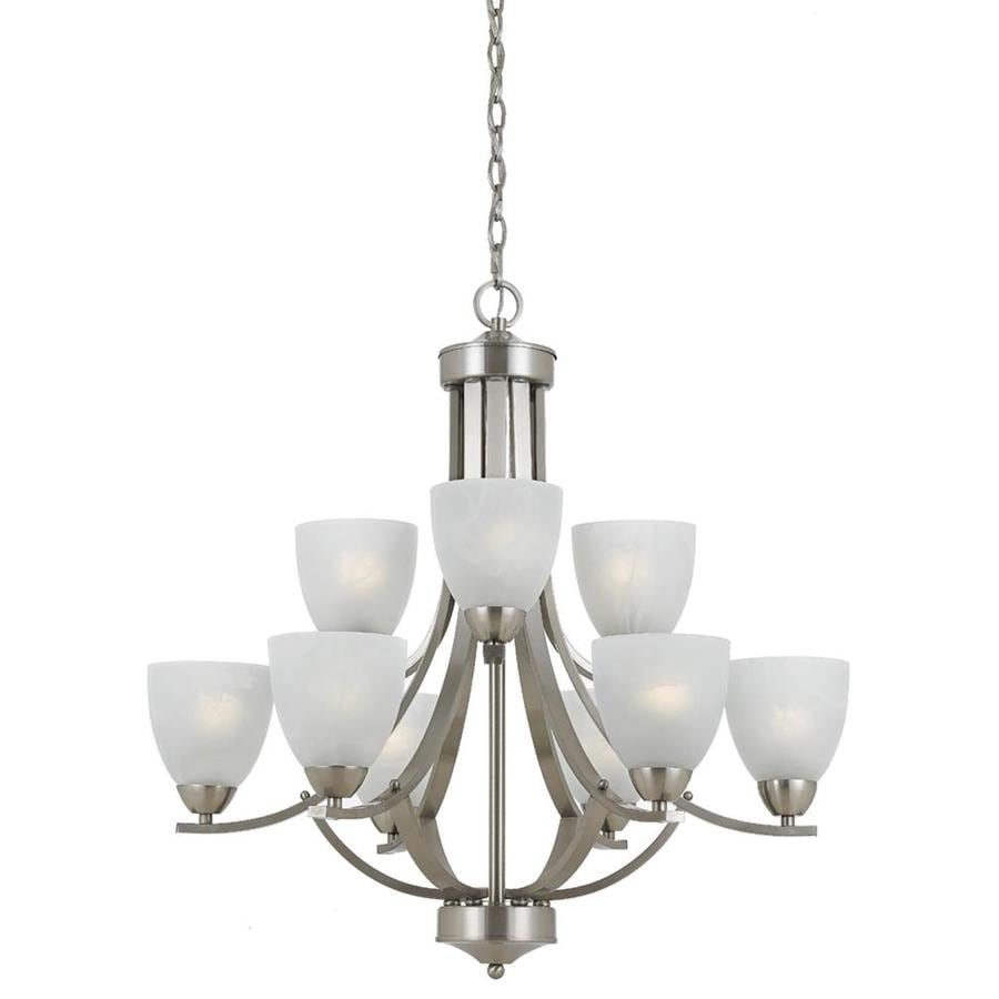
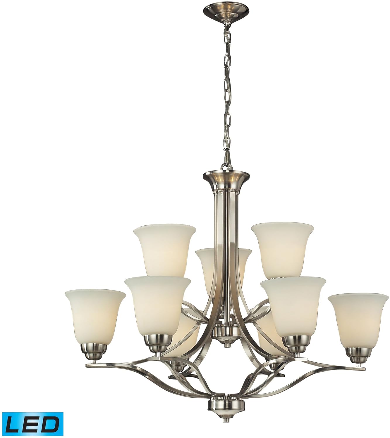
Here are the options I had narrowed it down to, and I included the height of each fixture as comparison. (Honestly anything would be an improvement!)
 |
| Option A: 29.25 inches |
 |
| Option B: 28 inches |
 |
| Option C: 26 inches |
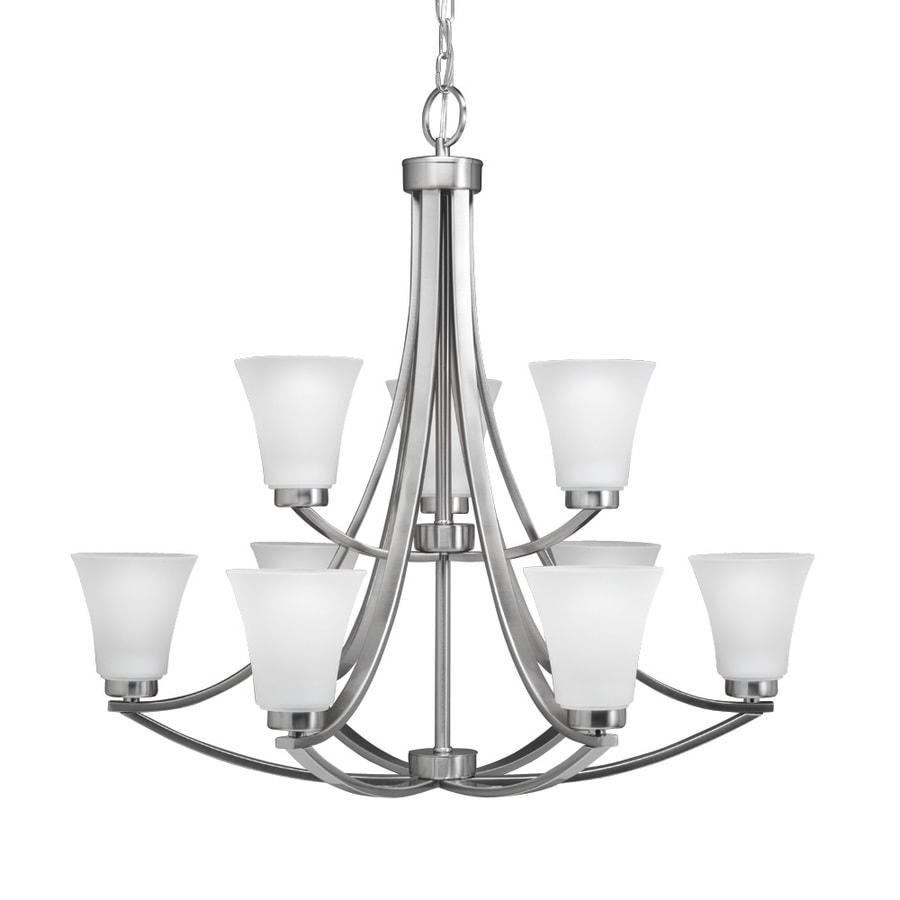 |
| Option D: 28 inches |
 After much debating, going back and forth, we finally picked one. Both Dear Husband (DH) and I preferred the same one, and it just so happened to be the least expensive by a lot. Either we have cheap taste or we got a really good deal (I'm hoping it's the latter.) We chose... Option D.
 Only after we chose it and as I was ordering it, I realized that the fixture is part of the same "design collection" as the lights we picked for our bathrooms!
 Along with upgraded lighting we are also refreshing the paint, both inside and out. Talk about a game changer. Of all the improvements we have made, I really think this will make the biggest visual difference.
The existing color is a light beige/tan sandy color with dark brown trim. I wanted to change it to a warm charcoal gray with white trim. Here is a sneak peek of the colors we were picking from.
There are three different grays, and three different whites (which are impossible to distinguish in the photo.)
I will leave you in suspense as to which one we picked for the outside, but here is the color palette for the inside:

I know it probably looks pretty boring to most people, but I am afraid of color, so this is a big step for me. The bright blue and yellow in the upper right are for the front door and the craft room.
I have to keep reminding myself to be bold, color will not hurt me!
No comments:
Post a Comment